apricity painting

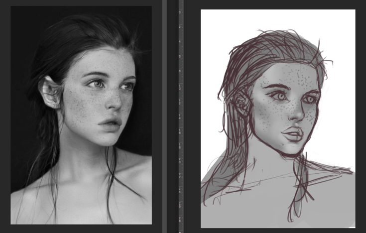
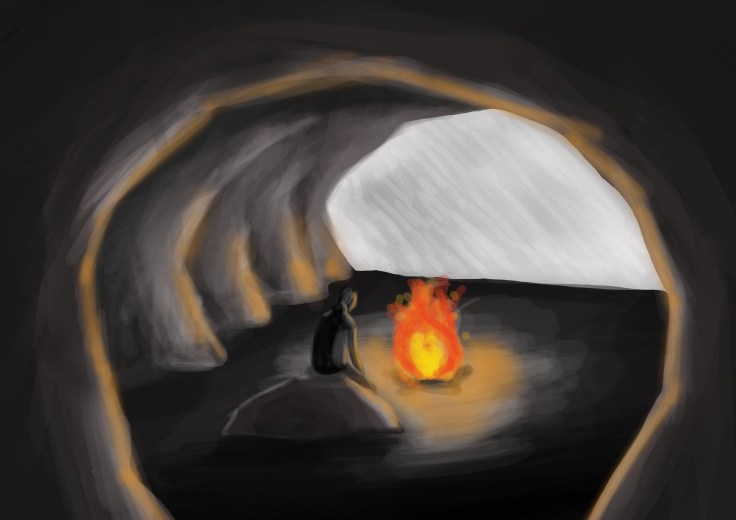
This artwork is one of my experiments for the keyword project and even though it doesn’t look that good, in my opinion, it’s interesting, because unintentionally, I managed to make it look like a crayon or pastel drawing, even though it was made in Photoshop. I’m not particularly proud of it, because, even though, it doesn’t look that bad, it’s still not something I intended to illustrate. The good side about this though, is that now I have this knowledge and I can recreate it next time when I make something similar.  It opened my eyes in a way, since the realisation hit me, that if you’re skilled enough digitally, you can make even the digital painting look like it was made with traditional methods and that blows my mind.

The topic for this post will be an unfinished digital drawing of mine. Couple of weeks ago I set myself a goal to draw every single day and to improve, so these past days I’ve been just drawing realistic images, using various references and one of those images is what I want to talk about. I can say for certain, that my ability to draw faces is getting quite decent , but there’s one challenge I can’t seem to overcome just yet. The challenge is drawing lips from any angle that’s not straight, so this type of study is great for overcoming that. This practice also taught me that having a sketch with all the details helps so much when it comes to digital painting, because before finding this little piece of info my sketches and drawings used to be so much messier. On top of that, my understanding of how light and shadows work are incomparably better to how it used to be before I started drawing so frequently. Another thing that kind of hit me unexpectedly, is that how can you hope to get good at lighting and shading, if you don’t have a solid understanding and basics of drawing.

Screen Shot 2018-12-20 at 15.46.23

As you can see, there’s still a ton of things to improve on, but I’m fully aware of that and trying to work on it.

This work is my favourite one out of them all, because I put the most effort into it. It’s a logo for my fictional. ‘Alpricity’ company, which specialises in winter mountaineering clothing and gear. I believe, that logo design is one of my strengths, so even at the beginning of the project, I knew that, most likely, my final piece would be a logo. The decision to use a mountain goat (ibex) as the animal for the design, was made after a lot of research into Alps. Honestly, I chose Alps out of all of the mountains in the world, just because it could be made into a wordplay ‘Alpricity’ and that’s way more interesting than just calling the company ‘Apricity’, which is the keyword I chose. Now, when it came to the choice of colours, this is where, I think, I’ve done something quite clever: I looked into all of the countries that had Alps in them and looked at their flags. I noticed, that all of the flags have one thing in common, the colour red. Red also symbolises such things as heat, love, action, courage, leadership and I wanted my brand to be associated with braveness and action, so that was perfect.

Screen Shot 2018-12-19 at 10.24.40

Now this work, was a really spontaneous and quick piece, that got inspired by the artwork above. My idea was to use just the gradient and strokes to draw a field of ice and blinding sun in the horizon . I wanted to do it with traditional methods, but since the idea came to me at a very random time, I didn’t have any paint available, so I had to resort to digital software. I start off with dark strokes, which represent the depths of the water and the thickness of the ice, moving forward with more greenish blue and lastly, into the white, which is, of course, the sun. I could’ve made the artwork more detailed and interesting, but I felt like it would take away some of its charm, because it’s interesting to try and convey a meaning without actually showing anything.

apricity drawing_

The second work is also from the same keyword project, but a totally different take on it. This piece is simply a melting block of ice, with a rose stuck inside of it. Melting ice is my slightly abstract attempt to symbolise winter and how it’s ending, while the rose represents the beginning of spring and life. I was inspired by a Pinterest post, showing you how to shade ice and, of course, since I’m an aspiring digital artist, I couldn’t pass up this opportunity. At the beginning it wasn’t intended to be a part of the project, but as I went along, I realised that I could add extra features to the artwork, like the rose, to make it related and symbolising the meaning of the keyword

apricity experiment ice

Create a free website or blog at WordPress.com.

Up ↑

Design a site like this with WordPress.com
Get started