
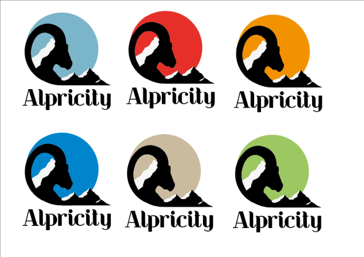
This work is my favourite one out of them all, because I put the most effort into it. It’s a logo for my fictional. ‘Alpricity’ company, which specialises in winter mountaineering clothing and gear. I believe, that logo design is one of my strengths, so even at the beginning of the project, I knew that, most likely, my final piece would be a logo. The decision to use a mountain goat (ibex) as the animal for the design, was made after a lot of research into Alps. Honestly, I chose Alps out of all of the mountains in the world, just because it could be made into a wordplay ‘Alpricity’ and that’s way more interesting than just calling the company ‘Apricity’, which is the keyword I chose. Now, when it came to the choice of colours, this is where, I think, I’ve done something quite clever: I looked into all of the countries that had Alps in them and looked at their flags. I noticed, that all of the flags have one thing in common, the colour red. Red also symbolises such things as heat, love, action, courage, leadership and I wanted my brand to be associated with braveness and action, so that was perfect.

Leave a comment