While looking for some videos that could help me draw better on Youtube, I found a guy named Dave Greco, who’s an artist and a game developer, and he’s been doing concept art for 14 years professionally. He has a lot of videos, which tackle the topic of drawing, but this video in particular caught my eye. The way Dave drew his drawing on the video was really intriguing and fresh to me. The way I drew my drawings was vastly different, so it felt like that video opened new doors for me and I’ve noticed a big improvement on my art, when I started doing the same thing he does.

Screen Shot 2018-12-20 at 14.06.11

Dave Greco. (2018). Character Concept Art Tutorial. [Online Video]. 17 May 2018. Available from: https://www.youtube.com/watch?v=2tMagqFKQ9E&index=3&t=525s&list=PLbcywHdwkAlhjfvjpmQ0QY8_GzjoJiFxP. [Accessed: 14 December 2018].

Reflection

Now that the keyword project has ended, I would like to take a look at the work that I’ve done and try to reflect on it. I’ve created artworks with some variety of mediums and while I could’ve experimented more, I believe that this is enough for me, as experimenting with more unorthodox methods wouldn’t have been as useful, simply because I’m certain that I will always spend  the most of my time on digital software and traditional means, because I enjoy it very much and that’s where the money is, at this day and age.

The first work I want to take a look at is this Illustrator piece of a stylised solar system. It wasn’t really planned, because I wanted to move on to making another digital painting. The idea to make a solar system illustration came from a Youtube music video I was watching. I can’t recall what video it was in particular, but I do recall that it had some sort of space themed background and I thought to myself: ‘Hey that looks cool, maybe I can make something related to space!’. This project was about your chosen keyword and you visual interpretation of it, so the difficult part was to relate my artwork to the word. Realisation hit me, that since I have to visually represent the warmth of the sun, why not take the Sun literally and that’s what I did. I really enjoyed working on this piece, because it stands out so much from the rest of my project’s works and it was a great practice with Illustrator

Screen Shot 2018-12-20 at 09.04.00


Professional development

This post is going to be all about my first term and my goals throughout the term. The first term started off really hectic, with a lot of client briefs in a short period of time, which can make even the most collected designer stressed. The year started with Lee Stafford brief, which asked us to create a trifold for hair and beauty treatments and as it turned out, after the whole summer of not using InDesign, I got really rusty with it and right away there was pressure to meet the expectations of the clients. In the end, I refreshed my memory with the software and somehow pulled through. I think this project set the tone for the whole year: Deadlines must be met and if you don’t make it, you fail, as simple as that. Knowing that, I set myself a goal to work on each project at least a bit everyday, to meet the deadlines, while developing discipline and time-keeping skills. After a couple of projects, I quickly realized that my tactic is useful and it does develop those skills rapidly, so, I guess, in a way I met one of my goals for the term 1.

Another goal I set for myself was also similar to my first one. I am a lazy person, so it is hard to motivate myself to draw on my free time, but then the realization hit me. If I do not practice on my own, I will never improve and if I don’t, then I won’t be able to achieve my dream to be a pro concept artist. Simple rules were set, draw 1 hour a day at least, and if you think about it, 1 hour doesn’t take that much out of your day, but it does improve your skills if you keep going at it. In a way those 2 goals are very similar, it all boils down to discipline, and that’s not just a short-term goal, that’s something I should keep up throughout my whole life, so I figured it’s not too late to start now.

There are more small goals I set myself everyday, but the 2 mentioned are my big ones, that I not just should, but MUST, achieve, so I’ll keep going at it and keep you guys updated!

Critical analysis

ruler_by_wlop_da92lk2-fullview

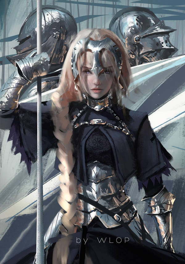
Today, I would like to talk about a work that interests me in particular. It is an artwork called ‘Ruler’ by a Chinese artist Wang Ling, who also goes by an alias’ wlop’. The piece depicts Jeanne d’Arc, a Japanese animation ‘Fate’ character, based of the heroine of France and Wang’s take on it. The main focus of the artwork is , of course, the Jeanne herself, holding her spear and two of her soldiers standing behind her. In the anime, this character is a ruler, which Wlop takes into consideration, and visually conveys this with the expressions on character’s face. This artist in particular, puts the most of his effort into the faces, accurately portraying emotions and you can clearly see that Jeanne is full of determination, but at the same time you can see the hint of sadness, perhaps, because even being in charge of the army is a huge burden on her, not to mention the whole country’s fate relying on your shoulders. The emotions are clear to see and even if you look at other works of wlop, you can see that all of them convey emotions concisely, you can tell what’s going on and the mood of the piece immediately. That’s one of the reasons why I like Wang Ling in general, but the ‘Ruler’ is the absolute best of his, when it comes to that. It is those subtle hints in the facial expression that makes it.

The thing, that makes the artwork particularly interesting, is the fact that Wlop manages to make the work really messy and sketchy, yet at the same time very detailed and full of life. That is not something just any artist can achieve. Most of the artists strive to make their art as clean as possible, but Wang does it slightly different and that is the charm his works have. If you take a look at the armour Jeanne is wearing, you can see, that the colours aren’t blended and they’re blocky, put together on top of each other, yet look stunning and realistic. This shows the artist’s expertise in drawing the materials. In my opinion, when it comes to armour, no one beats this man and ‘Ruler’ is the artwork I would show people who doubted that.

Last thing, which catches the eye is the use of colour and the contrast between them. Wlop tends to use cooler colours for the background and cloth, but when it comes to armour, you notice that it shows an impressive array of colours being reflected from whatever the wearer is standing in front of. Now even though, bland colours are used in the piece, if you focus on the face, you are greeted with a lot of warm tones, which enhance the emotion he’s trying to convey, in this case it’s the determination and sadness. Warm tones and detailed face, make the ‘Ruler’ a pleasure to look at and this contrast between the colours is why the piece is my favourite.


Bibliography

On this post I’d like to talk about some texts and I’m interested in and I draw inspiration from.

I’ll start off with http://www.bigbadworldofconceptart.com, which is a website that talks all about the concept art. I find it helpful, because if you have any question related to concept art, it can be answered there. After seeing a particular post on that website, my way of seeing things changed and I want to talk about it. The post talks about how to motivate yourself to draw if you are someone, who’s lazy like me, so in my eyes, this is golden material. Basically, there are 4 points to the formula: 1. You have to wake up earlier or go to sleep later and spend that time drawing, so you have that little extra time you can spend on honing your craft. 2. You have to reduce the amount of time you spend on TV or playing video games, which is fair, since at this day and age, we all spend too much time on those. 3. Ignoring distractions when you are busy, that way you’ll get into a habit of focusing on work. Lastly, 4. Replacing your phone with a sketchbook. Don’t worry, not literally. If you have 5 minutes to spare, instead of checking your phone, get your sketchbook out, it’s as simple as that. It might sound sounds like common sense, but I tried to follow those 4 points, and what do you know, it actually works if you commit to it.

Another interesting designing help I’d like to talk about comes from a book called ‘The digital canvas’ by Jonathan Raimes. It’s a book that, essentially, shows you the basics of digital painting and the software functions. I find it quite interesting because even when you think you know most of the things about digital painting, you can still find something new and totally fresh that you didn’t know before and it makes you happy in a way, that you’re glad that you found the book and decided to take a look.  The book also features a brief history of digital art, an easy to comprehend hardware description, software and many other things that any beginner (and a veteran) digital artist could learn and pick up fairly quickly.


Professional practice

As a designer, I must look at other professional designers, who are successful at what they are doing and how could I learn from them, so here are a couple of designers that inspire me. The first designer that I want to look at is Jason Chan. Jason is a senior designer at Riot Games, who, on his website describes himself as a illustrator who specializes in sci-fi/fantasy and young adult novels. He has taught private lessons on concept art and has lectured on a ton of international conferences. His concept art is amazing and he’s the sort of artist I strive to be. His works are clean and visually pleasing.


That’s only 2 of his countless designs and all of them are just as stunning as the other. He loves what he does and he gets paid huge amounts of money for it: That’s the kind of job I’m aiming for once I’m done with my studies.


Goals

My name is Zygimantas, but call me Ziggy. I’m 19 year old graphic designer, who’s currently studying Level 4 HND course. My passion is drawing fantasy characters, creatures and all kinds of crazy environments, but I also quite like making logos (especially geometrical ones), posters and whatnot. I mainly use digital software like Photoshop and Illustrator, not as much InDesign, cause I find that program boring, but I’m trying to improve on all of them, cause they are essential for any designer. In my free time you’d usually find me, either drawing or designing something, working, exercising or just lazily laying in bed. So, thats all about me, you can find out more by following my blogs!


Blog at WordPress.com.

Up ↑

Design a site like this with WordPress.com
Get started